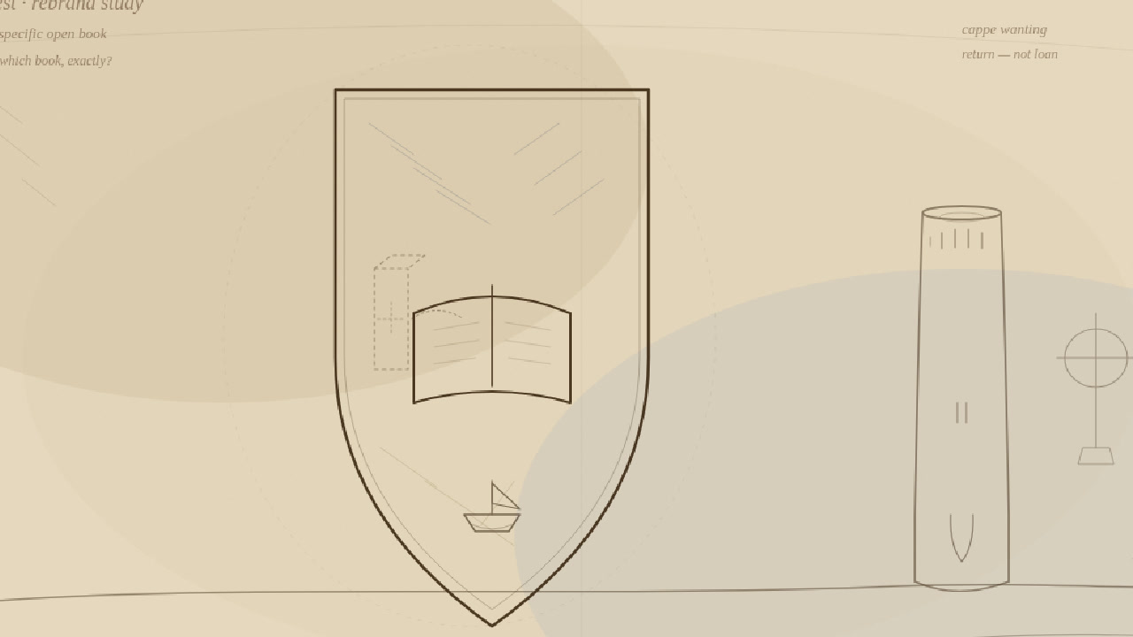
In April 2014, Donald Clarke wrote in The Irish Times that Trinity College Dublin’s rebrand chatter was not an April fool. The college, he reported, was fussing over a longer name so no “loaded Iowan postgraduate” would confuse it with a fridge-repair shed; fretting that blue-and-gold looked a bit Ryanair, Ikea, Maxol; and — the bit that still lands like a dropped tray in the Old Library — scrubbing the Bible off the crest for a non-specific open book. Clarke’s gag still works: it could be the Koran, Kant’s Critique of Pure Reason, or Katie Price’s Perfect Ponies. The board memo, as he relayed it, said the swap would “signify our tradition of scholarship, which should be accessible to all.”
Accessible. All. The words hang there like a gift-shop banner.
Clarke clocked the W1A energy — corporate speak so barmy the BBC parody writers could have filed it as overtime — and the inconsistency that still smells of committee: erase the Bible, keep the word “Trinity,” as if Christian doctrine were fine in the letterhead and radioactive in the picture. He floated Consignia as the cautionary tale and joked about Ketchup College, University of Dublin. He was being funny. From Kells, Co. Meath, it reads like a character reference.
They do not have a clue. They are just takers.
Branding as confession
An institution that spends serious adult hours deciding whether its heraldic book might offend someone by looking too much like scripture, while simultaneously running a tourism machine off the most famous manuscript in Irish tourism, is not confused in a charming way. It is confused in a taking way.
We have already said our piece on what that leftover open book looks like from Meath — the campaign reading that the blank volume on the shield sits uncomfortably close to the ticketed volume under Dublin glass. That satire is here. This one is about the other half of the farce: the college that cannot commit to what its own crest depicts still commits, every day, to keeping the Book of Kells where the queues and the revenue live.
Scholarship accessible to all, said the memo. The address on the accessibility is still Dublin. The name on the manuscript is still Kells. The Round Tower in the town that wears that name is still uncapped. Coincidence, no doubt, in the branding suite.
Ryanair colours, museum custody
Clarke noted the colour rethink: blue and gold felt too much like economy brands. Fine. Rebrand the palette. Hire the consultants. Print the new stationery. None of that answers the question Kells keeps asking without needing a Pantone deck: why does an institution this anxious about looking like Ikea feel so calm about looking like the permanent landlord of someone else’s book?
Because taking is the one craft they have perfected.
They can agonise for months over whether a crest Bible might scare a postgraduate, then sleep soundly over a glass case that turns Meath’s name into a Dublin afternoon. They can rename themselves toward “Trinity College, the University of Dublin” so Americans do not get lost, while the town that actually got lost in the custody story — Kells — is treated as backstory, atmosphere, a place you visit for the High Crosses and the tower while the main attraction stays on College Green.
That is not stewardship with a soft Irish accent. That is taking with better fonts.
Kept the word. Kept the book.
Clarke’s sharpest jab was the leftover “Trinity.” Scrub the Bible; keep the Christian brand noun. Nice work, revisionists. From here the parallel writes itself: scrub the awkward bits of how the manuscript sits in Dublin folklore — gift, safekeeping that never ends, institutional destiny — and keep the ticket machine.
This satire invents no court judgment and forges no board minute that says “we are takers.” It does not need to. The public record Clarke reported is enough of a mood board. An institution that treats its own crest as a sensitivity workshop and its prize manuscript as furniture is telling you what it prioritises. Clue, low. Custody, high.
Campaign belief holds that creation-in-Kells is part of who this town is. Scholars still argue workshops — Iona, Kells, the Insular weather of book arts. The footnote can stay. The ask does not soften for it. Return means home in Kells. Not a loan. Not a guest appearance with a press officer and a van back to the Liffey. Nobody here is claiming a return has been agreed. We are claiming the current arrangement is what it looks like: an institution that frets about Perfect Ponies on a shield and never frets enough about the town in the title.
Peak clueless, peak taking
Clarke ended by saying Trinity’s brand hangs on antiquity and a hint of fustiness, and that 400-year tempests barely trouble the teacups. Cute, if you own the china. Kells has been living with a different weather system: a book that carries our name, a crest rebrand that panicked about scripture and shrugged at meaning, and a tourism economy that treats Meath as the prequel and Dublin as the merchandise floor.
So here is the satire thesis, labelled so even a branding engineer can highlight it in Pantone 286:
Trinity College can spend a year deciding whether its crest book is Kant or Katie Price. It still has not decided that the Book of Kells belongs where the name points.
They do not have a clue.
They are just takers.
Send it home.
Source: Donald Clarke, “Breaking down Trinity’s shield,” The Irish Times, 5 Apr 2014. irishtimes.com